Click on the figure for a high-resolution version.
Notice that the figure is color-coded and uses a number of symbols to help differentiate each of the methods. The various colors allow you to quickly determine which method to use, depending on what you're trying to visualize (Data, Information, Concept, Strategy, etc) and text color identifies methods appropriate for either Process or Structure Visualization. The chart is interactive - if you mouse-over any of the elements of the table, a small pop-up window will appear containing a sample of the visualization method.Let's look at an example - the treemap - this is the periodic table entry for the treemap,
which according to the periodic table is used for Information Visualization, can be used to provide both an overview and detail, and represents convergent thinking.
Prior to doing this piece, I had never heard of a treemap, so I did a little research - here's a great site that presents news aggregated together as a treemap.
http://www.marumushi.com/apps/newsmap/newsmap.cfm
I encourage you to explore this site - it's pretty cool. The different colors represent different types of news (World, US, Sports, Entertainment, etc); different shades of color indicate the age of the news (brighter shades are less than 10 minutes old, while increasingly darker shades are older); and finally, the size of each rectangle is related to the number of news stories found for each topic. It's comforting to see that there's a little more coverage of Congress than of Anna Nicole or Bald Britney.
Now let's look at how my data and your data might become treemaps. Let's imagine that we're asked to discuss the following table of data,
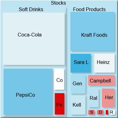
which details a number of companies, their market sectors and market caps - a measure of a company's size calculated by multiplying the current stock price by the number of outstanding shares. This is a fairly simple example - but it's not hard to get lost in a table even this small. Panopticon Software has a short tutorial showing how to go from the table to the following treemap and there's an evaluation version of their software that you can download and test drive.

I think you would agree that this view of the data is a lot more visually appealing and much, much easier to understand.
There's nothing wrong with tables, but take a look at your data and at some of these techniques - could your students (could you) benefit from a fresh new view? It's worth a shot!
In future postings, we'll revisit the periodic table from time to time and examine some of the other methods in greater detail.


4 comments:
Very cool! I look forward to checking this out in more detail. Thanks!
Mike,
This great information and very useful for designers of instruction. Thanks for the post.
Karl
Great images illustrating the difference between how information is perceived using a treemap compared to a table! I believe they are both borrowed from the information visualization company Panopticon Software?
I did mention the tutorial was from Panopticon. I should have been more clear that the figures were from there site as well.
Post a Comment