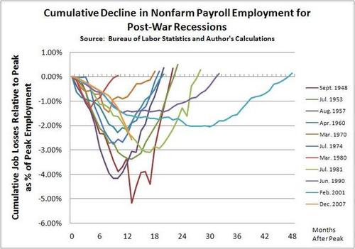
The Pelosi graph has now been supplemented by Justin Fox's and William Polley's. I reproduce the more complete one. I note that even Martin Wolf says this won't be as bad as the 1930s. The decline started more shallowly than others but is heading vertically down at this point. Still, others have been worse, and the 2001 recession was shallower but far more extended than previous ones. One cannot predict the future, but one recalls that many recessions begin before we realize it and end the same way.
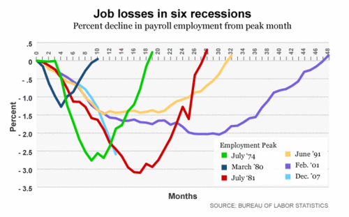
Fox's less cluttered graph is after the jump:
Tuesday, February 10, 2009
A Picture is Worth a Thousand Words
Great graphics comparing job losses in the current economy to job losses during previous recessions. The Daily Dish | By Andrew Sullivan - A Better Graph
Subscribe to:
Post Comments (Atom)
LinkWithin

No comments:
Post a Comment